


Is your website ineffective, in need of a refresh, or maybe just low-key sucks (borrowing words from clients pre-project, I promise)? Here's the top 3 reasons it's just not making the grade, plus how to improve your website conversion! You know we're all about the tangible how-to here.
If you're more of a video-watching girlie (this is ME waiting in preschool car line or while getting ready in the morning), you can watch the YouTube video that goes with this post below!
Mistake #1: You're scaring clients away with piles of copy on your homepage
(or your copy is so sparse that you half expect a digital tumbleweed to roll across the page)
Your website copy should be long enough to get your point across, but skimmable so that you're not overwhelming people with words. People don't read websites; they skim them. If your website loads to reveal a novel, you're likely losing visitors to immediate overwhelm. Not to mention, extra-long copy is hard to format (thus, ruining a clean and organized aesthetic).
Improve your website conversion by breaking up copy with this flow:
This prevents you from flooding website visitors with too much info on their first click, but keeps it in a user-friendly structure that ensures they'll go on the journey you want them to
- Enticing overview copy on your homepage + landing pages
- More in-depth information on your services page that includes the benefits of working with you and the logistics – emphasize the benefits and personal impact first!
- If you have more than 2 distinct specialties or services, use your main services page as more of an overview that links out to specialties pages.
Want an example? Here's the Services overview page and Services (specialty) page from my Addison website template!
Mistake #2: You're making it hard for people to get started
There's a reason that the main navigation/menu of most websites is pretty similar: because we've all grown to expect it. So let's capitalize on that acclimation and use it to our advantage when setting up sites!
Your main navigation should have no more than 5-6 links, and contain: Home, About, Services, maybe FAQ, and your Contact page.
Anything beyond that should go in a dropdown menu, the footer, and/or be linked out from other pages (like the services/specialties pages above).
This makes it so easy for people to see exactly where to go to get started working with you, which is exactly what we want!
Mistake #3: You're not asking for the sale
(or the conversion)
I see so many website pages that are set up beautifully with great copy, photos, etc. – but the sites are underperforming because they're missing a key component: calls to action.
A call to action is exactly what it sounds like – asking your website visitor to take action. If you let people set up a discovery call with a scheduler, or if you have people submit an inquiry form first – those are your CTAs. They can even be links or buttons to other pages!
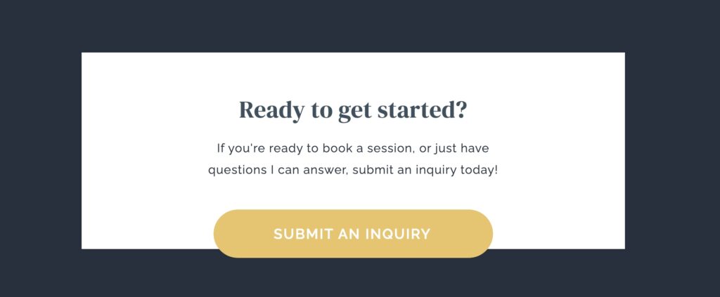
Here's what you need to know about CTA's:
- You should sprinkle them throughout all of your pages
- Add a CTA to start working together at several points during your services page (top of page, middle, and at the bottom)
- End all of your pages on a CTA, whether it's to browse the next logical page or to submit an inquiry/book a call/etc.
Last: make your CTA's clear and concise! Actually ask and encourage people to work with you by highlighting open spots on your caseload, saying you're booking new clients, and how to get started.
Want to improve your website conversion with ease?
Grab one of my website templates designed just for wellness pros like you and take the guesswork out of your site! Choose the template that suits your vibe, customize it in days, and launch with ease.


share this post
« NourishED Colorado | Branding + Website Design
Best Private Practice Dietitian Websites of 2023 »