I know it's a cliche to start a post like this, but I truly cannot believe that it's almost 2024 – which means it's time to round up the best private practice dietitian websites of the year!
I started my business in March of 2023, and since then I have served 10(!) businesses with custom brand + website design. For reference, my goal was two paid projects my whole first year in business – so I'm humbled & floored to have blown that goal out of the water.
Are you a designer looking for the secret to success with your design business? Good news: My secret's not a secret. Here's a post I wrote about the one thing I attribute my year one success to!
What actually makes the best private practice dietitian websites?
Okay, let's start with the basics: what actually goes into not only making a website, but making a website well? Here are the key components I think your nutritionist website needs to not only survive, but thrive.
Clear Website Organization & Layout
To be clear, I love when people get creative on their websites. It's so fun! You're unique! And we're going to capture it in your beautiful brand and site like gangbusters! But there absolutely is such a thing as being too creative, and it's when you start putting things in weird places where no one can find them.
I design from a user experience standpoint, which means I'm thinking about how to make using your website as easy as possible for people who visit it.
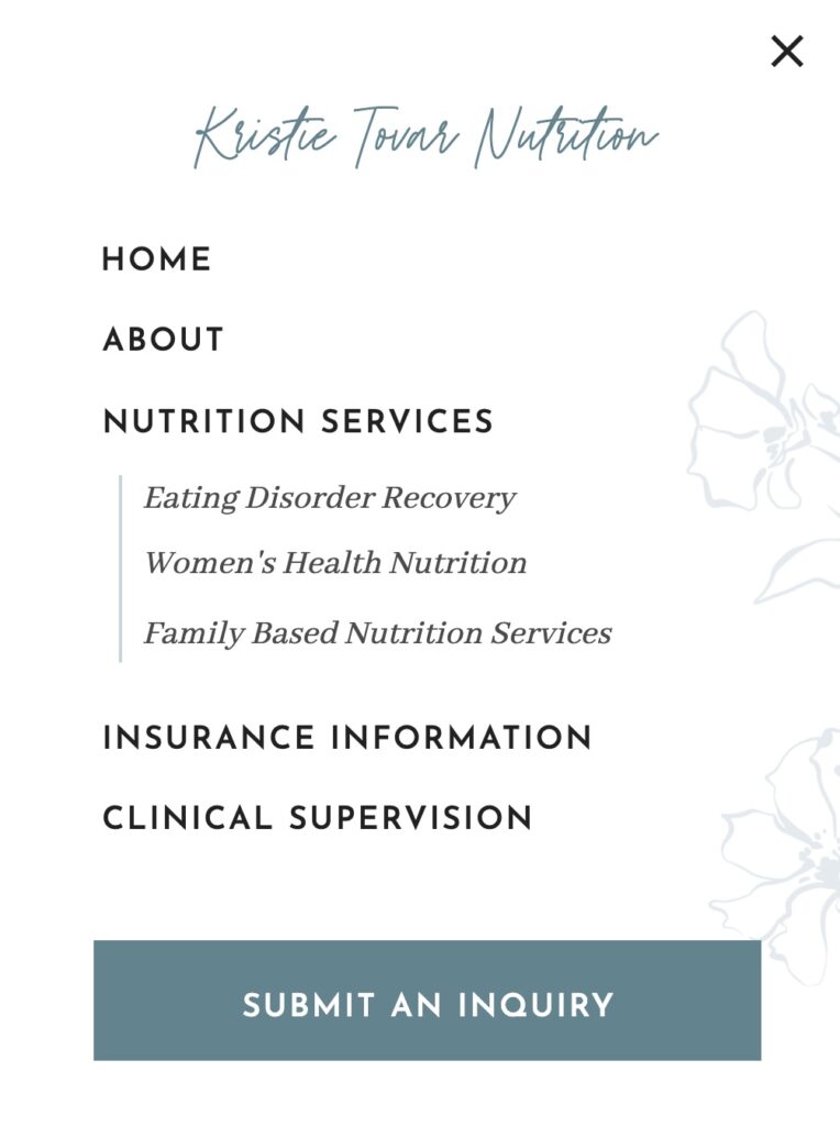
POV: Your website is clean, organized, and crushing it. It has…
- Your main menu has Home, About, Services, and Contact. Each of those pages follows a certain order and flow that we (as certified Internet Users) have come to expect.
- Your contact page + footer have your contact information (or the footer links to the page), and you have clear headings that stand out visually and make sense to separate your copy.
- Actual text for all of the most important content (and not images of text that you styled to be pretty for the bulk of your copy. Don't do it. Don't.)
Strategic Website Copy
Website copy is one of my favorite parts of a project, and also one of the hardest when it comes to working with dietitians, therapists, and other private practices. Why? Anecdotally, I think it's because we talk for a living and are used to having a full session to convey our messages and unpack. We want to convey nuance. We want to show understanding. We want to use 1,000 words per sentence.
Things is, people don't read websites – they skim them.
You know that TL;DR (too long; didn't read) you find at the bottom of some social posts? Your website copy should be written in the TL;DR format – clear is kind.
If you're having a hard time cutting back on your copy, here's how I do it with website projects.
- Write your services page first (it's the easiest because it's the most straightforward). If you have more than two specialties, give those their own pages that link from the services page (NOT in the main navigation. Want to see what I mean? Check out this Services page from my Addison website template, and click through the specialties!)
- Break up your copy into your website page, with no more than 3-4 sentences per paragraph and no more than 2 paragraphs before you add a heading or subheading
- Highlight key phrases that sound like you – scroll through your socials for inspiration, too!
- Write your About page next, using some phrases from your Services page
- Write your homepage last and pare it way back. Your homepage should be skimmable and give people a quick idea of who you are, what you do, and that you're great to work with

Welcoming Photos
One of the first investments I recommend new businesses make is brand photos, and there's a reason: They truly make or break your website design. They're also incredibly useful for social media, email signatures, etc. You don't need an hours-long shoot to start – just a short photoshoot that gives you a variety of framing + shots will do the trick.
If you can't invest in professional photos, storebought is fine you can use carefully chosen stock photos, BUT
*Stands on soapbox, grabs megaphone, apologizes in advance*
Stop using photos of crying people and salads on your private practice dietitian website.
Thank you for coming to my TED Talk.
People don't want to envision the struggle they're experiencing, they want to envision the solution. The outcome. The place you're going to help them reach.
They also want to see people that look like them. Make sure you incorporate diversity of ability, identity, ethnicity, etc! Free sites like Pexels and Unsplash are great starting places! If you have a small budget, I highly recommend trying iStock or even browsing Etsy.
Want to see more ways you can elevate your private practice website? Right this way!
Now onto the good stuff.
My Favorite Private Practice Dietitian Websites of the Year
For the record, they're all my favorite. But I'm narrowing it down to three, and choosing based on unique elements that each nutritionist practice incorporated!
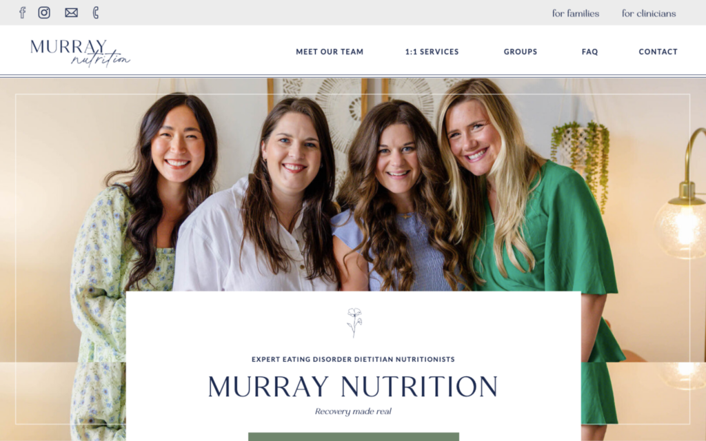
Murray Nutrition: Group Nutrition Private Practice Brand + Website
Murray Nutrition wins for elegant aesthetic. Ever since their August launch, if I get on a discovery call and someone references my past work – 9/10 times, they're talking about Murray Nutrition.
If you're a lover of words wondering how the heck to fit all that copy into your site: Here's your example.
This is one of the longer websites I've designed, but also has the coolest features to make it all fit and avoid visual overwhelm.
Because we designed Murray Nutrition's website on Showit, it was easy to incorporate features like hidden canvases (sections) that drop down and reveal more copy when clicked. (And that copy still “counts” toward SEO! Google reads it!)
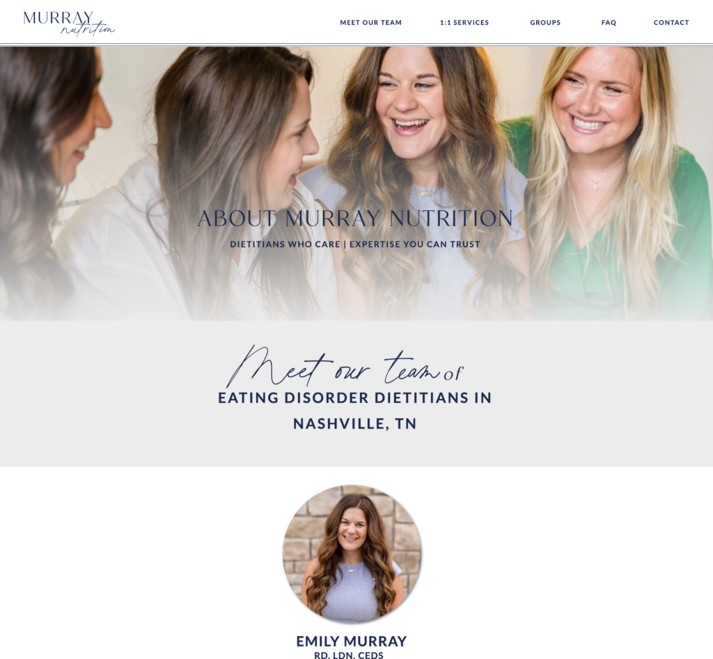
The Murray Nutrition team also had stunning brand photos done ahead of our project, which completely cemented the final result. This site looked very different before the photos came in! We actually re-styled several sections to work around the photos – which is why I don't start projects until photos are back now!
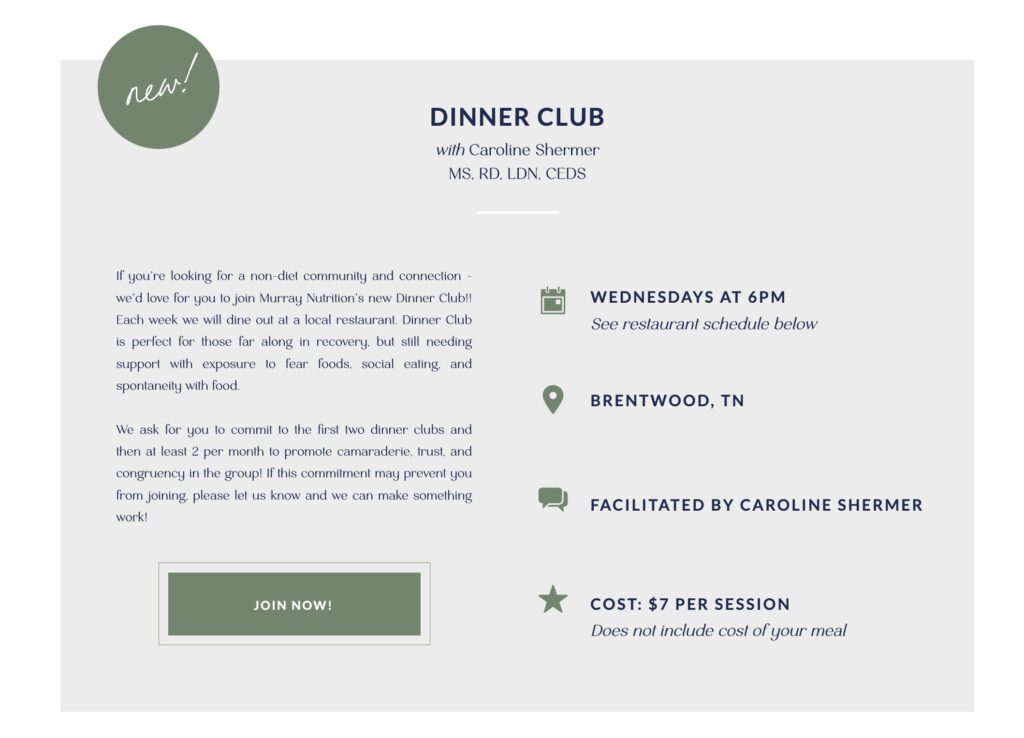
Finally, the Murray Nutrition groups page is a forever favorite. It has several styled sections that can be hidden, revealed, duplicated, and edited to accommodate information for any and all future groups! I've used this technique on several nutritionist websites since. When I say I want your website to be user-friendly, I also mean the maintenance for you, too!
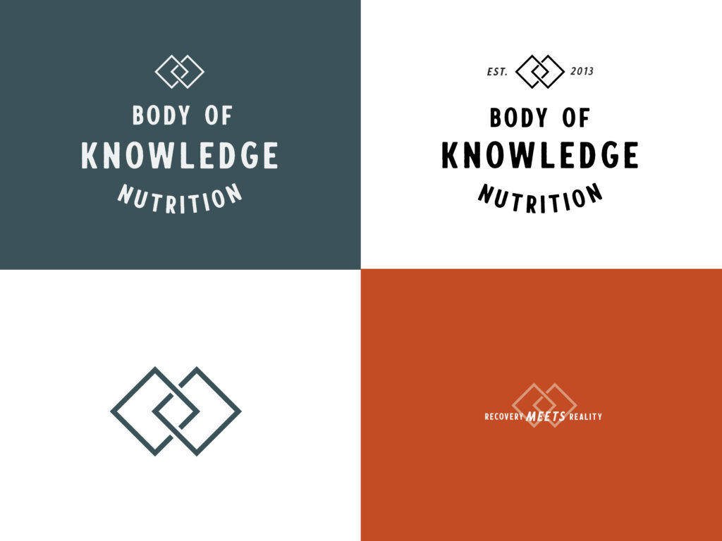
Body of Knowledge Nutrition: Solo Private Practice Brand + Website with Courses
Meagan reached out to me for a rebrand and fresh website to celebrate her 10th anniversary of private practice, and it was so fun to help! Meagan's brand voice is direct and full of personality – as a client, you forever get brownie points with me if we do things like incorporate the word bullsh!t into your copy.
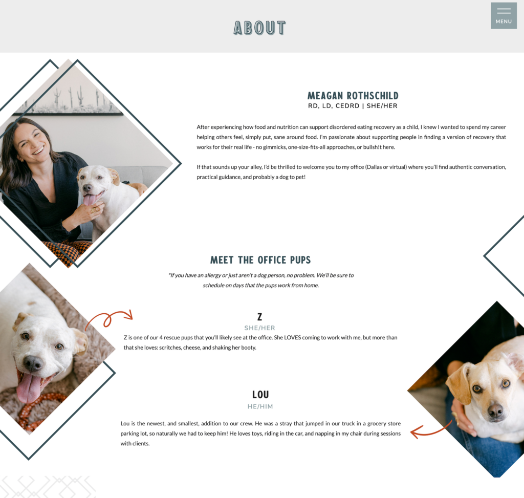
Meagan also had fresh branding photos taken as part of her redesign, and since two of her four dogs are loyal office pups – they obviously had to be included.
Write bios for dogs? Check. Add adorable pictures of said dogs? Check x 10, because I put them several places.
Design a sales page for the coolest nutrition course idea I've ever heard? Unrelated to dogs, but CHECK. Meagan created Kitchen Intuition as we designed her site, and when I tell you I wish I still saw nutrition clients so I could send them here, I'm not joking.
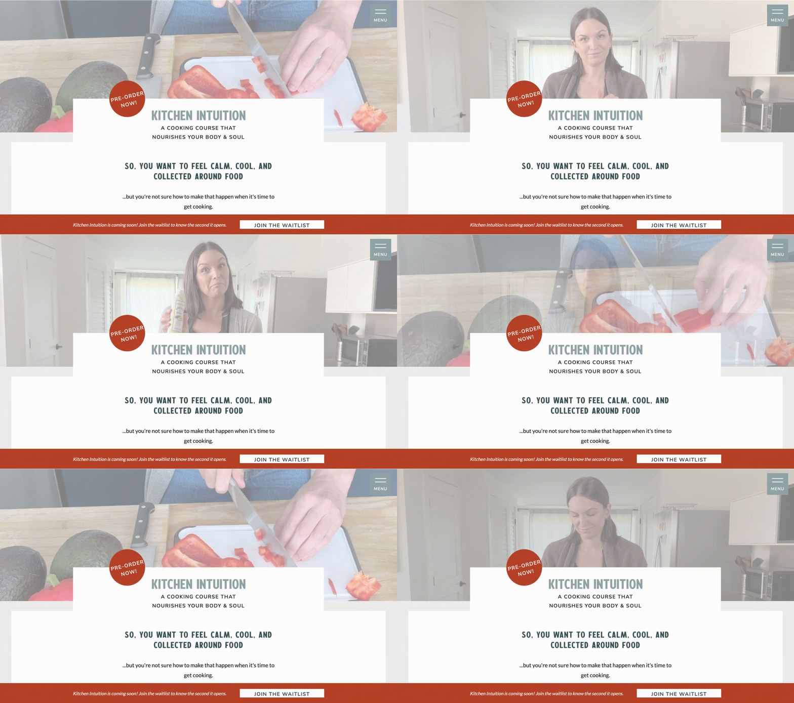
It's got everything from intuitive eating info to kitchen skills, plus delightful recipes. Meagan's a culinary pro who really loves being in the kitchen, and it shows in her teaching.
NourishED Colorado | Group Nutrition Private Practice Brand + Website
NourishED Colorado will always stay close to my heart, because it was partly formed at my kitchen table. Hannah and I were briefly roommates while I lived in Denver, and NourishED with Hannah was a few months old with big private practice dreams.
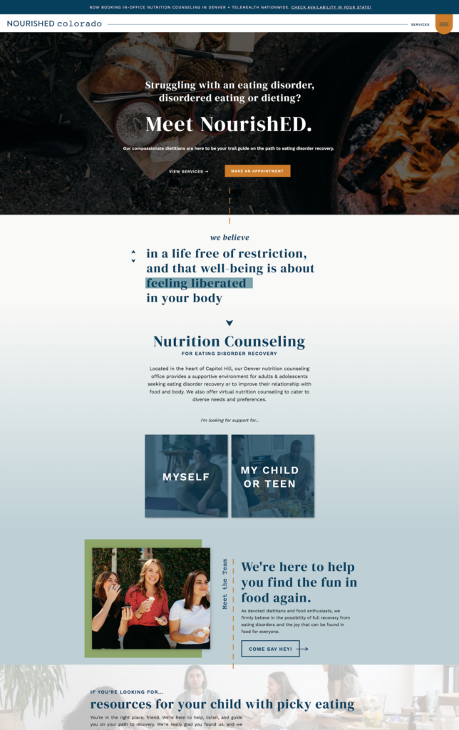
One of the biggest challenges and fun aspects of the NourishED Colorado website was incorporating lots of user-friendly design on the back end so that clinicians can easily be added in group information can be changed.
NourishED Colorado has a large dietitian team, averaging 10-12 clinicians – so how do we present all of the dietitians and their unique personalities without creating a copy-overloaded page?

With expanding canvases, of course! And the best part? Because Showit has so many canvas options that are code-free, we created not only a beautiful effect but there's about two steps to adding another dietitian to this page when the team expands.
The Best Website Platform for Dietitians
Fun fact: all THREE of these websites are designed on Showit, my favorite website platform for private practices! I love, love Showit for all sites but especially dietitians – because it combines easy, gorgeous design with the power of WordPress blogging. So if you blog recipes, you can easily add any needed recipe + other plugins to your blog and watch the posts push themselves through to your beautiful site!
Designing Your Best Private Practice Website Yet
If you're looking at this list and feeling overwhelmed, I have good news! Building a beautiful website with strategy, personality, and a conversion-minded approach doesn't have to be hard work – or even work at all.
If you're ready to get a new website up and running with minimal effort and tons of payoff, you need one of my Showit website templates for private practices.
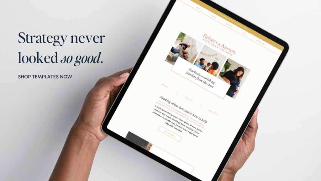
These templates are created on the most user-friendly, flexible platform with every section and page you need when starting your private practice. They're created to give you room to grow into your website, but also to help grow your business with a major focus on helping clients know, like, trust, and hire you.
Choose between the pre-crafted mini brand that comes with your website, or import your own logos, colors, and fonts to create a truly custom-feeling website with ease!
And by now, you know I'm fully invested in helping your business succeed – which is why each website template comes with a detailed step-by-step course on customizing a site that truly feels like you!

share this post
« Top 3 Reasons Your Website Isn’t Converting (+ How to Fix Them!)
Among the Trees Counseling & Wellness | Branding + Website Design »