

The Hello & Co Blog
Everything you need to simplify your business & make your messaging leave a mark.


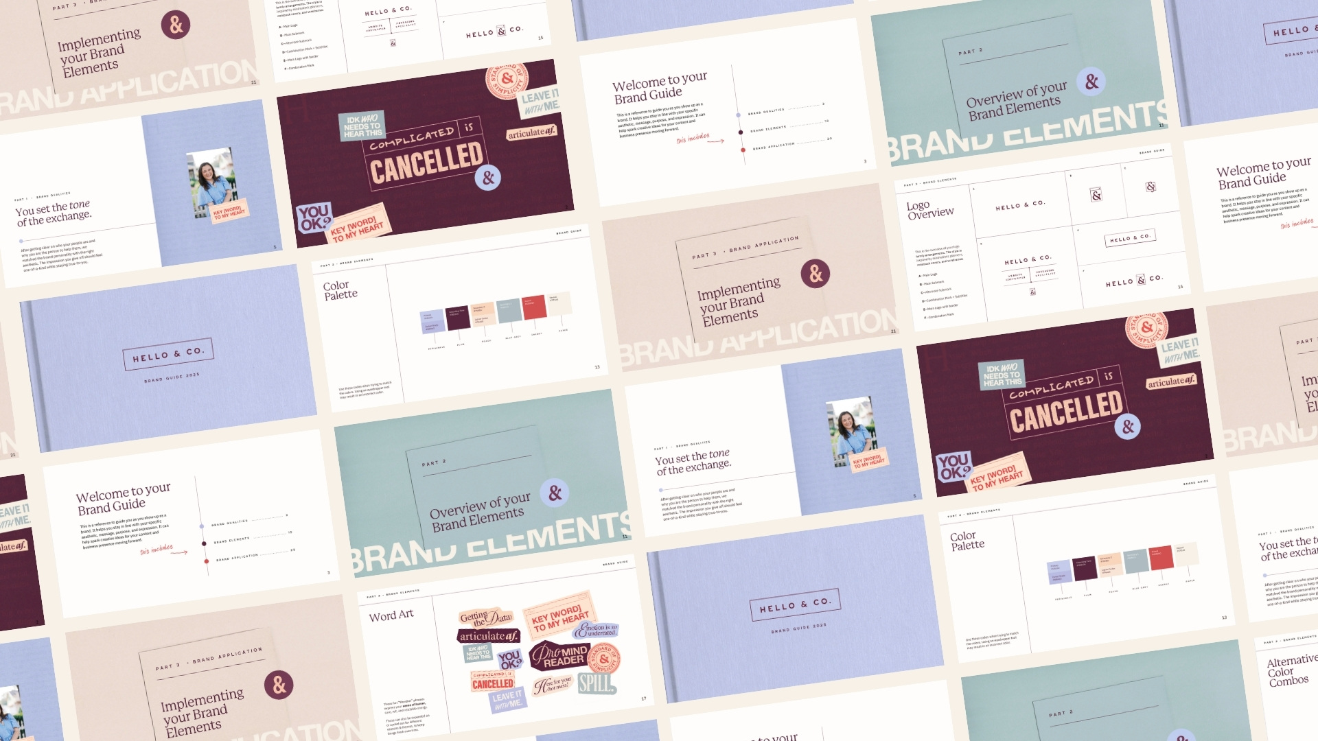


More Website Tips


Effortless marketing starts with words.
Hi, I'm Amy — the website copywriter and messaging specialist you learn from when you're tired of the "high-volume, high-burnout" marketing model.
When you're ready to prioritize aligned content and amazing inquiries over an inbox full of red-flag requests, words are where you start — and I can't wait to help you find and flex them to your fullest advantage.
Behind THe Blog

Everyone wants "more clients, with less work!" — but I'm here to help you actually get there.
Inside the Booked, Not Busy podcast, I'll teach you exactly what your website copy should be doing for you, where it might be dropping the ball, and what it needs to convert browsers into real, paying bookings.


Try Termageddon →
Simple, self-updating website policies - use code HCREATIVE for 10% off!
Termageddon Website Policies
Try loom →
My favorite way to record project walkthroughs for clients & save them a meeting.
Loom Video Recorder
Try Flodesk →
A simple, easy, AESTHETIC AF email marketing platform - take 25% off your first year!
Flodesk Email Service Provider
Try Thrivecart →
A powerful point-of-sale platform with a single lifetime payment.
ThriveCart Sales Platform
Try Dubsado →
THE main way I keep my business organized - use code HELLOCOCREATIVE for 20% off your first year.
Dubsado Client Management
Try Showit →
The same drag-and-drop website builder I use! Use code HELLOCO for a free first month.

