When to Rebrand – Behind the Scenes of My Rebrand & New Website Design

Branding

when to rebrand

past projects

Website Tips

SEO

categories

Freebie library

Work Together

connect

Website copywriter on a mission to preserve your purpose through words that align, intrigue, and convert.

Hi! I'm Amy.

browse by category

past projects

Branding

copywriting

marketing

SEO tips

Rebranding can feel like a daunting task, but sometimes it’s the most empowering move you can make for your business. I launched my own rebrand and new website this week (PS, welcome!) and it was an undertaking, but already paying off!

My original website and content were from the very start of my business – and even though that was only a year ago, I've since designed dozens of websites, curated my portfolio, niched down to focus on wellness and coaching businesses, and have actually worked with my ideal clients. Here’s how to tell when to rebrand & if it’s time for you to do the same!

Signs It’s Time for a Rebrand

Outdated Visuals

Trends change, and what was hot a few years ago might now feel stale. If your logo, color palette, or overall design feels like it's stuck in the past, it’s a clear sign it’s time for a refresh. Your brand should feel contemporary and relevant to your audience.

Change in Business Focus

Businesses evolve. Maybe you started offering new services, or your target audience has shifted. If your brand doesn’t reflect these changes, it’s time to realign. Your brand should grow with your business, not hold it back.

Inconsistent Branding

Inconsistent visuals and messaging across platforms can confuse your audience and dilute your brand identity. If you’ve noticed that your branding feels scattered or inconsistent, a rebrand can bring everything into harmony.

Target Audience Shift

As your business grows, you might find that your target audience changes. Whether you're attracting a new demographic or focusing on a niche market, your brand needs to resonate with your current audience. 

One of my FAVORITE (and very specific) groups of people to work with is clinicians who are expanding their offerings to include consulting, courses, or other business-to-business services – having a professional brand + website from the get-go helps convey the expertise & professionalism you bring to the table – like on Hope’s site! (Plus, you likely know your audience already since you’ve been working with them for a while)

Client Feedback

Client feedback is incredibly valuable – and if clients are taking the time to tell you that your website was hard to use or cluttered, I’d actually thank your lucky stars because most people will simply X-out and choose a different business to work with! You can use website analytics to boost your understanding of how people actually use your site, then tailor your website strategy to your needs.

Lack of Engagement

A decline in social media engagement, website traffic, or conversion rates can signal that your brand isn’t connecting with your audience. Refreshing your brand can reignite interest and engagement. It also creates consistency, which is part of growing a truly powerful brand (and it’ll show in your engagement!)

when to rebrand

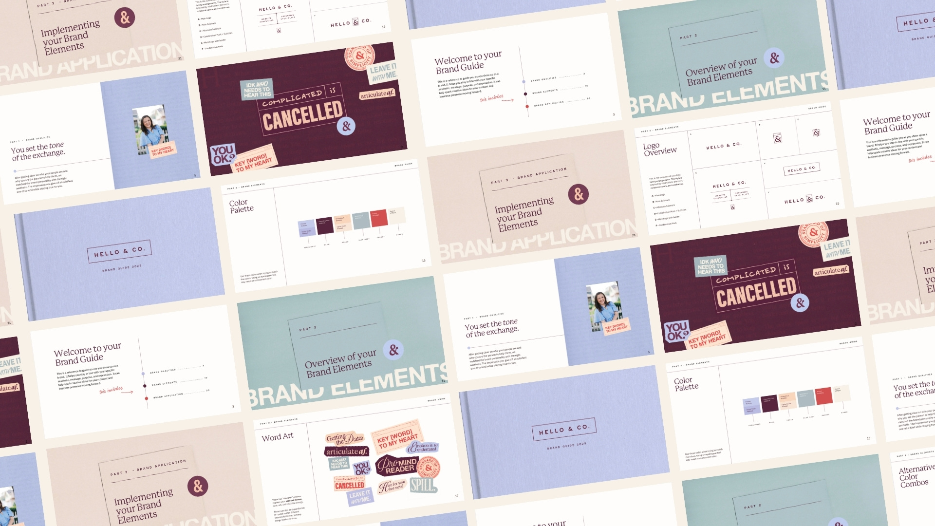
Behind the Scenes of My Rebrand

Where I Started

When I first launched my business, my website and content were all about getting things off the ground. It was exciting, but also a bit chaotic – I truly didn’t expect to be booked out at all in my first year! 

I’m SO grateful for the immediate growth – but it’s been one rapid change after another as Hello & Co honed itself into a niched-down studio with clear offerings. I quickly realized that my brand needed to evolve as I did.

Over the past year, I’ve designed dozens of websites and curated a portfolio that truly reflects my style and expertise. This growth has been incredible, but it also highlighted the need for my brand to keep up.

Niching Down

Hot take: I actually don’t believe in niching down when you start your business – I firmly believe that your niche is actually better when you allow it to find you over time. (One of my business mentors, Elizabeth McCravy, has a great podcast episode on this here)

I’m a retired dietitian, but I didn’t envision focusing on wellness brands when I started Hello & Co – in fact, my first-ever paid projects were a website for a children’s education company and a marketing virtual assistant business! 

But over time, my niche found me (I’m unsurprised really; I’m literally a healthcare provider-turned-designer) Specializing in copy and design wellness and coaching businesses has been one of the best decisions I’ve made. It allows me to serve my clients better and showcase my expertise as someone with an extensive health & wellness background who can clearly communicate clinical complexities in an actually enticing way! 

I wanted my new website to reflect that experience and feel really specific to wellness and service-based businesses, which actually had less to do with the brand collateral design (logos, colors, etc) and more to do with the copywriting.

Here’s some of my favorite lines of copy that highlight my niche!

Shooting New Brand Photos

One of my #1 priorities for my new website was shooting fresh brand photos – I’m still obsessed with my first brand photos (and wrote a whole post about how to plan & execute a brand shoot). But like my first website and starter brand, that set of photos was a little more general than I wanted for my new website, and I needed a fresh set of new photos with more neutral clothing to make it work.

Enter: Jessica Lauren Photography.

I’ve worked with Jess for multiple family photoshoots before, and I’m obsessed with her work – so I knew we’d make some magic together. We hopped on a planning call to figure out the vision, and she kindly invited me to shoot at her home studio so we could pick from her backdrop selection (ideal, really). 

We shot for about 3 hours (because again, Jess is the best) and she grabbed 200(!) photos that seamlessly tie into my new brand and site (and I’ll update my brand shoot post soon with some of the tricks she taught me)!

Website Redesign Strategy

My old website functioned well, but I did have a laundry list of things I wanted to improve and upgrade to make it even more user-friendly.

Highlighting Website Templates

When I designed my first website, I only offered 1:1 design services and later added content about my website templates as I launched them! One of my biggest goals was to highlight and explain website templates even better on my new website – because I truly think they’re the best and most powerful option for launching a website quickly, on a new-business-budget, and in a way that truly empowers you to make your site your own.

Adding a New Service

I’ve offered copywriting and support since the start of my business, but knew I wanted to gain more experience and education with it before really announcing specific SEO-focused copywriting services – which I’ve done over the past year of business! A new services page was the perfect way to showcase the whole thing, and let me get even more specific on my design services page, too.

A One-Stop Shop for Resources

My old website had separate pages for my favorite business tools and my free resources, and I intentionally combined them into one page for this new site so you can more easily access a PILE of resources that will help you scale your business online.

Just a Reminder: Your Current/”Old” Brand Isn’t Bad

I work with a lot of clients who have a hard time emotionally letting go of their current or old logos and website because they worked really hard to build them, and associate them with the “pulling myself up by my bootstraps” part of business. Which is why I want you to know:  there's absolutely nothing wrong with that brand and that logo.

It's surprisingly emotional to relaunch a new brand and website, because change in your business is scary.  A project this big also requires quite a bit of resources and time, and there's an element of fear that it may not be worth it, which I completely understand. 

One of the things I encourage clients (and myself, in this scenario) to focus on is the very heart of your business, which is staying unchanged –  nothing can shake your passion for your clients, your dedication to your work, and your mission. Rebranding and design are more about communicating those values more accurately, so you can find and work with more of your people (and ultimately, have a bigger impact).

Ready to step into your own obsession-worthy website era? Here’s how to do it:

FOR NEW BUSINESSES: Check out my collection of Showit website templates that will help you DIY a conversion-focused website in days, not months.

FOR GROWING BUSINESSES: Browse my design and copywriting services – I’ll help you write and design a results-focused website that elevates your business to the next level.

Hi, I’m Amy - website copywriter (and occasional blogger) at your service.

I help small businesses of all backgrounds find and work with more dream clients through conversion-focused copywriting with a personal touch. Think: well-researched, well-written, sounds-just-like-you, and optimized for Google, too.

If putting substance behind your marketing strategy is your goal, then really f*cking good website copy is what you need (and I’d love to be the one to write it for you).

work with me