In my opinion, the best private practice dietitian website options out there have a few key pieces of content that make them stand out and build trust with potential clients. This post could apply to most 1:1 service-based professions, but I’m going to speak specifically to the dietitians and therapists in the crowd – because I’ve been where you are, and I know what it’s like.
If you’re starting up a private nutrition or therapy practice – or you already started, and you’re overwhelmed – making a website is one of the first steps toward establishing legitimacy, giving clients a way to find you, and starting to showcase your skills and offerings.
Private Practice Dietitian Websites: What to Include on Each Page
Let’s look at a few key things that I recommend every private practice dietitian website include! These tips will help your website make a big impact with little effort.
Personal Bio, Professional Bio, and Credentials
Use your “About” page to establish your credibility upfront. All dietitians know about the million nutrition websites and offers floating around out there, so distinguish yourself by sharing about your credentials, education, and other qualifications of note.
To the degree that you’re comfortable, I also recommend adding some personality to your site! You can do this through stories, fun facts, maybe a family photo or two. Reaching out to a dietitian or therapist is a highly personal matter. Your rapport building and reputation begin the second a potential client learns about you! The more comfortable they can become while browsing your website, the better chances they’ll convert into a client and be able to experience your support firsthand.
Bonus: If you're a frequent podcast guest (or would like to be), you can add a professional bio here as well! Write this in the third person and use more formal language than your main bio. Then, you can send podcasts hosts straight to your “About” page when you need to share the bio. A professional bio is also a great way to add in SEO keywords, since you can speak a little more analytically and less casually.
Specialties & Modalities
I’m going to say something that I want you to hear for the pep talk it is: you are not for everyone and that’s okay. It’s such a good thing to be clear about the conditions you work with and services you provide upfront! It helps connect you with your ideal client, and allows people who may not be your perfect fit to move on with confidence.

(Branding & website design by Hello & Co)
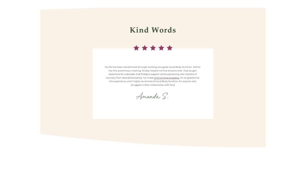
Kind Words from Past Clients
Remember that rapport I was talking about? A great way to begin is by making sure past clients’ reviews are shared (with permission!) in an easily findable place! Reviews from clients are the best thing to share, but if you’re just starting out, you can use kind words from coworkers and supervisors as well!
Investment & Insurance Information
I know this is a divisive topic, but I’m firmly in the “price transparency” camp. When prices are displayed on a website, it provides clarity and builds trust with potential and current clients. Without prices listed, you may lose inquiries due to uncertainty. You may also be spending a lot of time answering inquiries from clients that may not be able to afford your services, unfortunately. If you offer reduced-fee rates, insurance, or other options that make your services more affordable – list those and encourage people to inquire about them! Provide some reassurance upfront that options exist, then tackle those conversations 1:1.
Where You Work
Whether you’re only licensed in certain states, all-virtual, all brick-and-mortar, or a mixture of it all, give information about where and how you work! Let potential clients know off the bat if they’re in an area you’re able to serve.
Bonus: Add some photos of your physical office if you have one to help provide familiarity for clients trying to find you for the first time! If you only work virtually, you can log into an empty session call and take a screenshot of your computer to creatively show “where” you work!

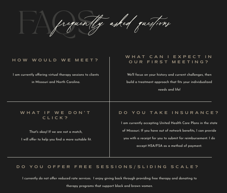
Frequently Asked Questions
“This might be a silly question, but…” I can’t possibly count the number of times I’ve started a sentence like this or been told this before a question! There are absolutely no silly questions – but FAQ sections can be so reassuring that 1) your questions are ones that others have had as well! And 2) they can help provide people with quick answers or even information they want, but didn’t know to ask for.
Want your very own dietitian website design?
Let's chat! Head over to my Services page to read more about how I can help your practice shine online, or add your email to the form below for my best tips on how to upgrade your site in less than a week!

share this post
« An Organic, Inviting Brand & Website for a Dietitian
A Bold, Refined Brand & Website for a Therapist »