Updated March 20, 2024
Today, I’m sharing a project that’s especially dear to me because I’ve had the pleasure of watching this business grow for 5+ years from a close perspective.
I have really fond, specific memories of sitting at my kitchen table working with Hannah and hearing her talk with passion about inclusivity in eating disorder care, making care accessible through insurance, and growing a sustainable business. It’s surreal to be sitting at that same table (even if it’s in St. Louis now!) to be revealing the new branding and website for NourishED Colorado!
About The Client
Since founding NourishED Colorado in 2016, Hannah has grown her work to include: 13 dietitians, a practice manager, a billing manager, and a casual TWO other businesses (see Hannah’s work with Values Driven Group and Weight Inclusive Innovators here).
NourishED Colorado got its start as NourishED with Hannah, and grew so quickly that there wasn’t much time for branding or site updates beyond adding more and more clinicians as they came. Here’s exactly how we created all-new, well… everything for Nourished Colorado.
Brand Identity Development
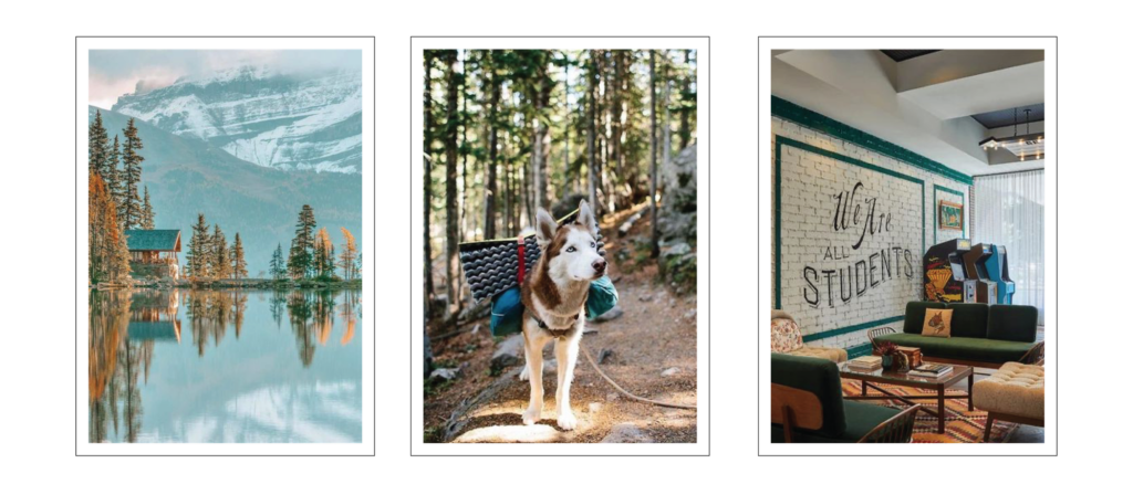
Our first step was getting clear on what NourishED Colorado values: inclusivity, compassion, and accessibility. Many, many Colorado-based brands have mountains as a significant part of their brand collateral and while we did want the NourishED Colorado branding to be inspired by the great outdoors, we needed two things:
- Subtlety (Hannah and I collectively vetoed “cheesy mountains”)
- A connection from NourishED Colorado's purpose and work to its branding imagery
We found both of those things (and more) in the concept of eating disorder dietitians as trail guides on the road to recovery: there to offer support, guidance, and encouragement on what is ultimately your journey.
Brand Elements
NourishED Colorado's logo suite includes a primary & alternate logo, plus two logo marks: one inspired directly by the outdoors and one as their signature compass emblem.
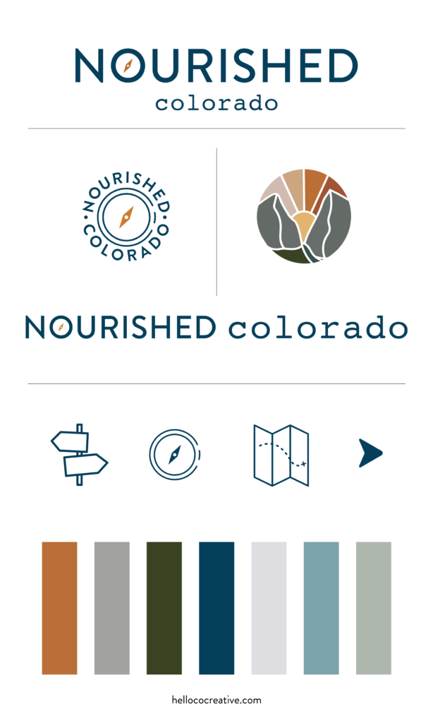
Their branding also includes a set of custom icons: a trail marker, compass, map, and arrowhead that help create the vision of guiding people on the road to eating disorder recovery.
Website Strategy
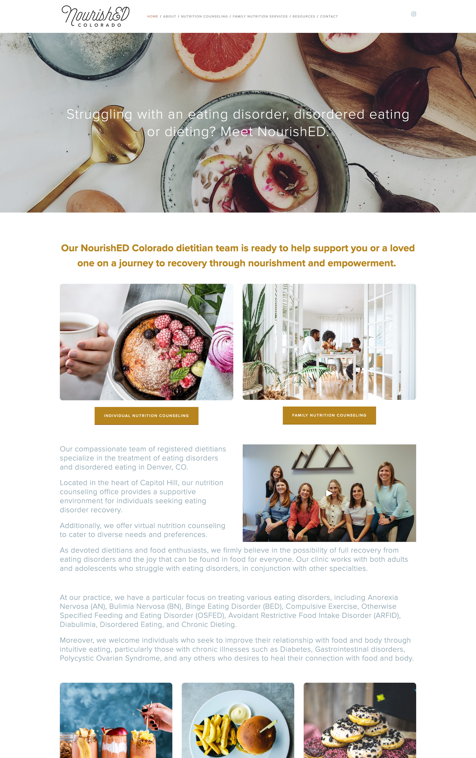
The website strategy for this project began the same way almost all of my redesign projects do: paring things way, way back.
The previous NourishED Colorado website was pretty cluttered, and had been added to here and there throughout the years without a ton of strategy – there were about 100 pages total, 90% of which were unused.
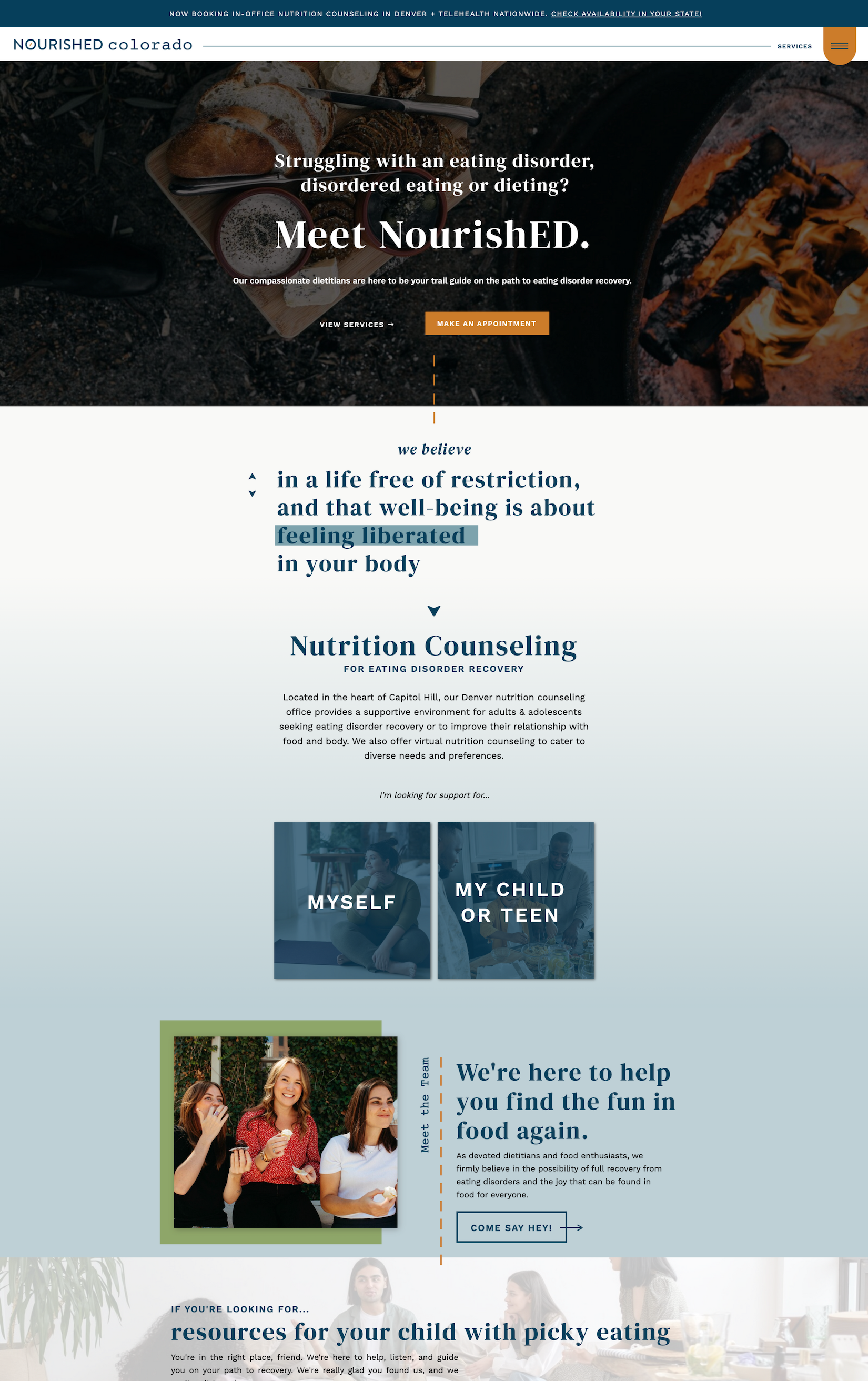
To organize the site, we began by identifying the two main types of clients that NourishED Colorado serves: adolescents and adults.
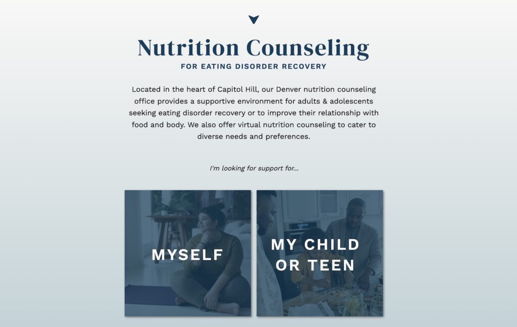
The homepage quickly helps visitors identify who NourishED Colorado services, and helps guide them into the right site journey based on age.
In the case of adolescents, the people reading the website are likely their parents, so the Family Based Treatment page was written to that audience with answers to their questions.
How To Design An About Page for 13,471 People
Okay, 13. Thirteen people.
But still – it's a lot. 😉

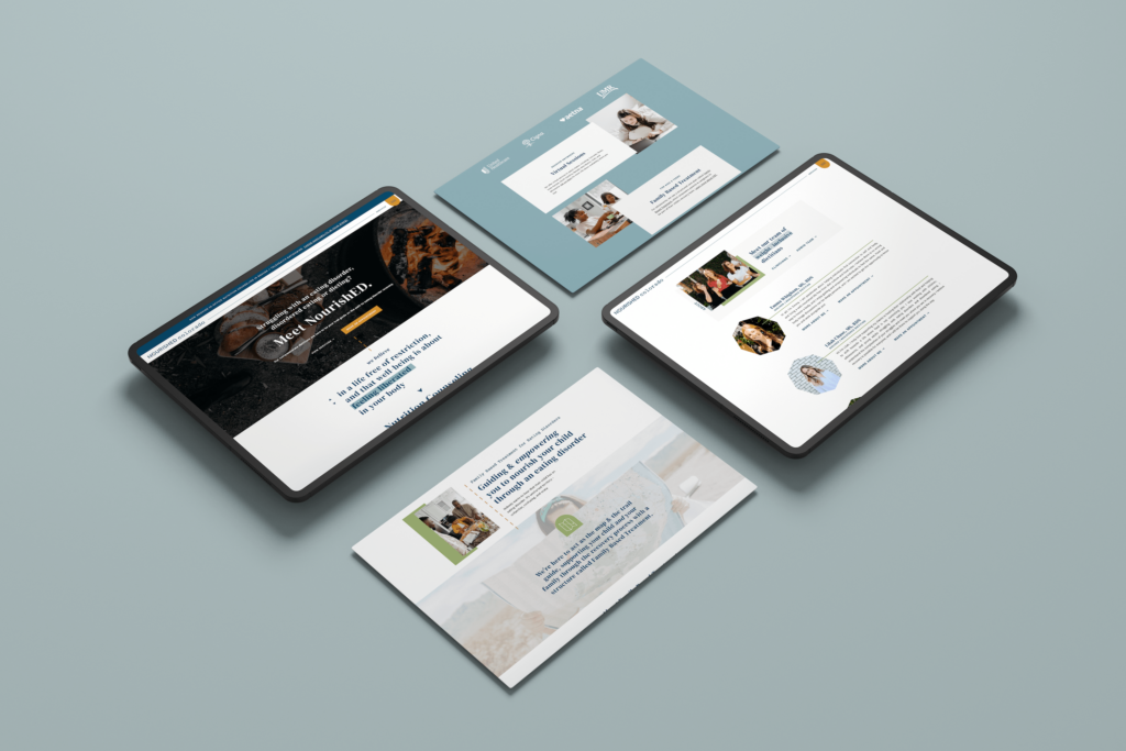
We took the Meet the Team page from cluttered to streamlined with these steps:
Eliminated individual dietitian pages
On the former site, each clinician had their own page and it made for a messy backend of the site and inconsistent + confusing visitor experience. Before deciding on this, we confirmed with analytics that the individual dietitian pages weren't contributing to the website's overall SEO.
Used hidden canvases and click actions in Showit to create two-part clinician bios
This allowed us to have a pared-back page on first glance, with sections for each dietitian that expand to show more information about their personalities and specialties with a simple click.
When you're designing a website/page, it's also important to think about what you'll need to update and how often. Structuring this page like this allows for team members to be added or removed from the site pages in just a few minutes while keeping the design intact. Throw in a custom tutorial video for the future (you know I always do 🥳) and this team is set for growth!
Added frequent calls to action
Every single clinician bio includes a link to book an appointment, meaning there are 15+ direct calls to action on this page alone!
Additional Brand Collateral
To round out the branding experience, we designed a set of Instagram templates, newsletter template, and updated referral flyer for NourishED Colorado to share with other clinics.
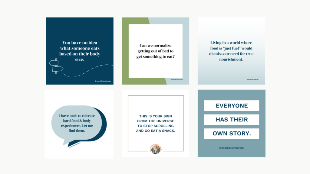
The Instagram and flyer templates were delivered through Canva, which means that it'll take about 0.05 seconds for the team to swap out the text + post!
Behind-the-Scenes of Launch
I've gotten requests lately for more behind-the-scenes info on how I execute projects, design, tips, etc. – so if that's you, stay tuned!
Launching a site can be as easy as designing + hitting “publish” – but re-launching a site that's already established and with a new design is a different task altogether.
Here are some things we thought about while we prepped for launch:
SEO Strategy
I made sure to pull data on NourishED Colorado's current SEO and organic traffic/keywords, then applied them across the site using basic best practices!
Redirects
I also made a huge list of needed redirects and installed them immediately once the domain was connected to the new site – that way, visitors with pages bookmarked or who click on old links are still taken immediately to the most relevant page & section.
Google Search Console
As with all projects, we ended by submitting a new sitemap to Google Search Console! This lets Google know that you have a new site and you'd like it to be mapped (please & thank you). As part of the 14-day support period post-launch, I'll be keeping tabs on pages as they get indexed and resubmitting them as needed.
The Review
“After our rebrand & website update with Amy, we've seen the number of inquiries who are ideal clients skyrocket to 87%! This shift has made our onboarding process smoother and significantly boosted our conversion rates. Amy didn't just deliver; she nailed our rebrand and even crafted marketing materials that perfectly match our new brand, making outreach a breeze. Thank you, Amy, for your tailored, outstanding work!”
You can view the final project at NourishedColorado.com!
Looking for your own brand + website upgrade? Check out my website templates + custom projects!
share this post
« Where to Get a Website Privacy Policy
Top 3 Reasons Your Website Isn’t Converting (+ How to Fix Them!) »