Today’s launch is for one of the most creative people I know – Katie Poland, multi passionate entrepreneur extraordinaire! Katie is an artist, photographer, marketing guru, and virtual assistant who helps businesses thrive by providing stellar support services. Spoiler: color + tons of different content + Showit website design = match made in heaven.
Katie wanted a website and branding that was professional and colorful, as well as made it easy to see at a glance what type of services she provides (spoiler: there’s a ton of them!). Her website also needed to showcase her family & wedding photography, as Katie still photographs families in the St. Louis area and is available to second shoot weddings.

The Brand
Katie's wishlist was: colorful, use a handwritten font, keep it professional! Here's a look at some of her logo suite.
The Website
With a long to-do list and lots of features to add, I knew Showit website design was the perfect fit for Katie! Creating a Showit website for someone with so many different passions, talent, and services was such a fun challenge! Katie and I brainstormed back and forth for a bit on all of the options (two websites? How many pages? What sections?) and couldn't be happier with where we ended up!

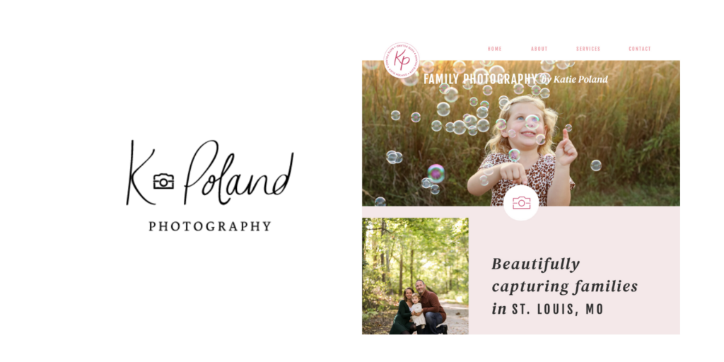
One of my favorite little details on the new site is that you can actually find her old K Poland Photography logo on her family photography page! A quick little digitize + color swap = a subtle walk down memory lane!

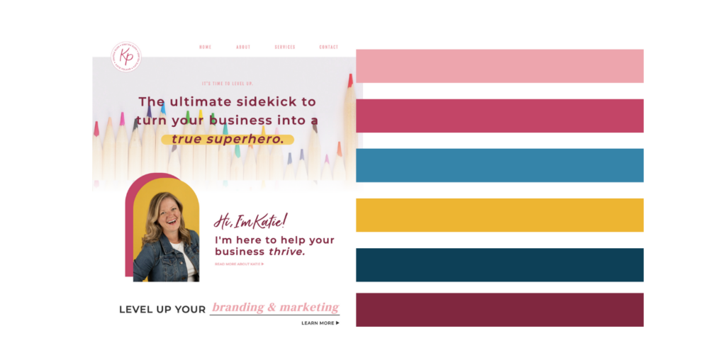
Another favorite Showit website design trick: Use those hover actions to add color on color on color! This helped us ensure that Katie's main pops of color (her bold pink, blue, and yellow) appeared throughout the site, creating an overall consistent vibe.

The final product uses some of my favorite Showit website design tricks, like autoadvancing canvases, to give you an overview of Katie's work with plenty of opportunity to dive in and learn more about each service she offers.
You can view Katie's finished Showit website here!
Want a gorgeous brand + Showit website of your own? We'd love to help! View our services page here.

share this post
« A Bold, Refined Brand & Website for a Therapist
Canva Brand Kit: Tutorial & Examples »