The happiest of launch days to Kristie Tovar Nutrition! I am so excited to be unveiling this project!
Kristie requested branding that feels warm, inviting, and safe. As an eating disorder dietitian (with a growing team), it was important that we created a brand + site for Kristie that was not only informative, but welcoming! This was such a project to dive into – one of my favorite types of projects is being called in when a private practice is growing and flourishing, and needs a new brand + site to reflect their success.
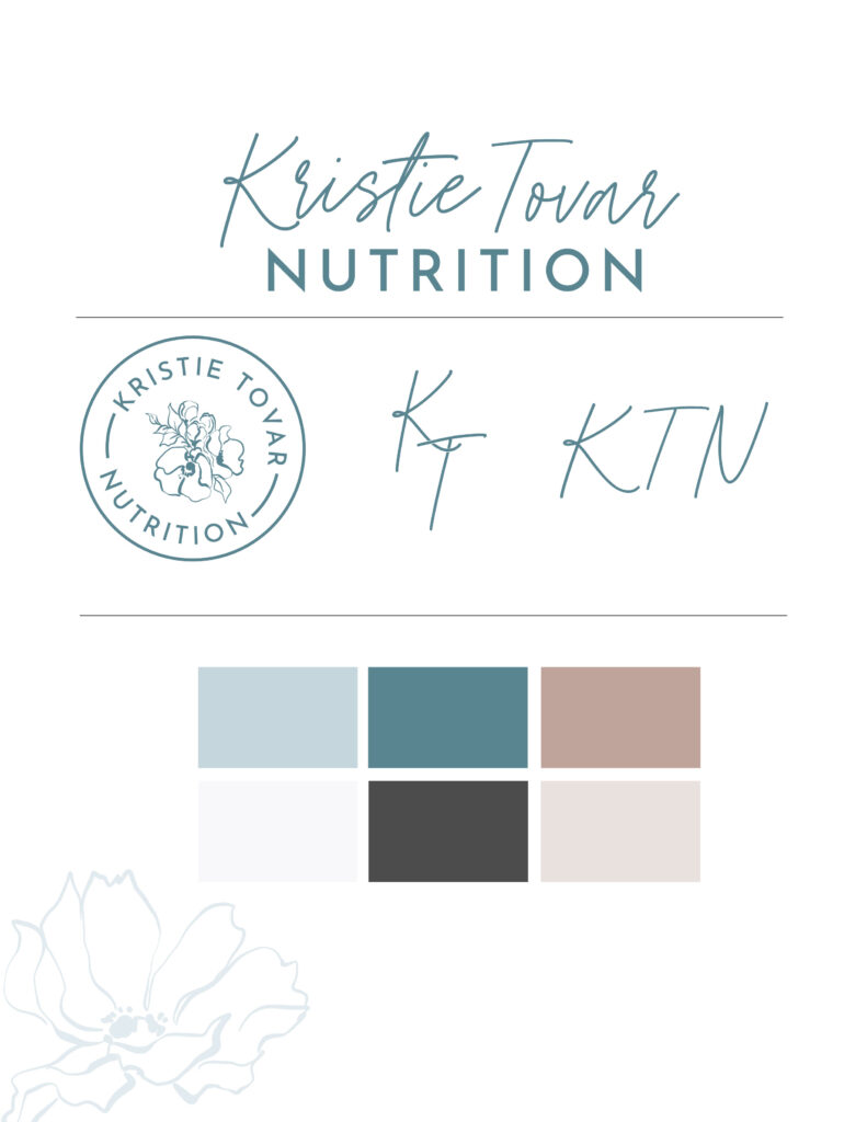
We created a primary logo + THREE logo marks for Kristie, so that she has tons of variety for future uses. This is why it's important to consider what you'll be using logos for when you start on a brad design journey – Kristie's practice primarily operates online, but she's envisioning stationary and some marketing materials that required different layouts of her logo and branding. By giving several options (plus details on when to use each in her custom branding guidelines!), Kristie is set up for any use case she can dream up! In addition to the logo suite, we incorporated hand-drawn florals into the website, which gave it the soft and welcoming feel she was hoping for.
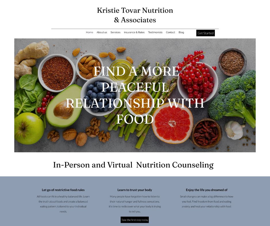
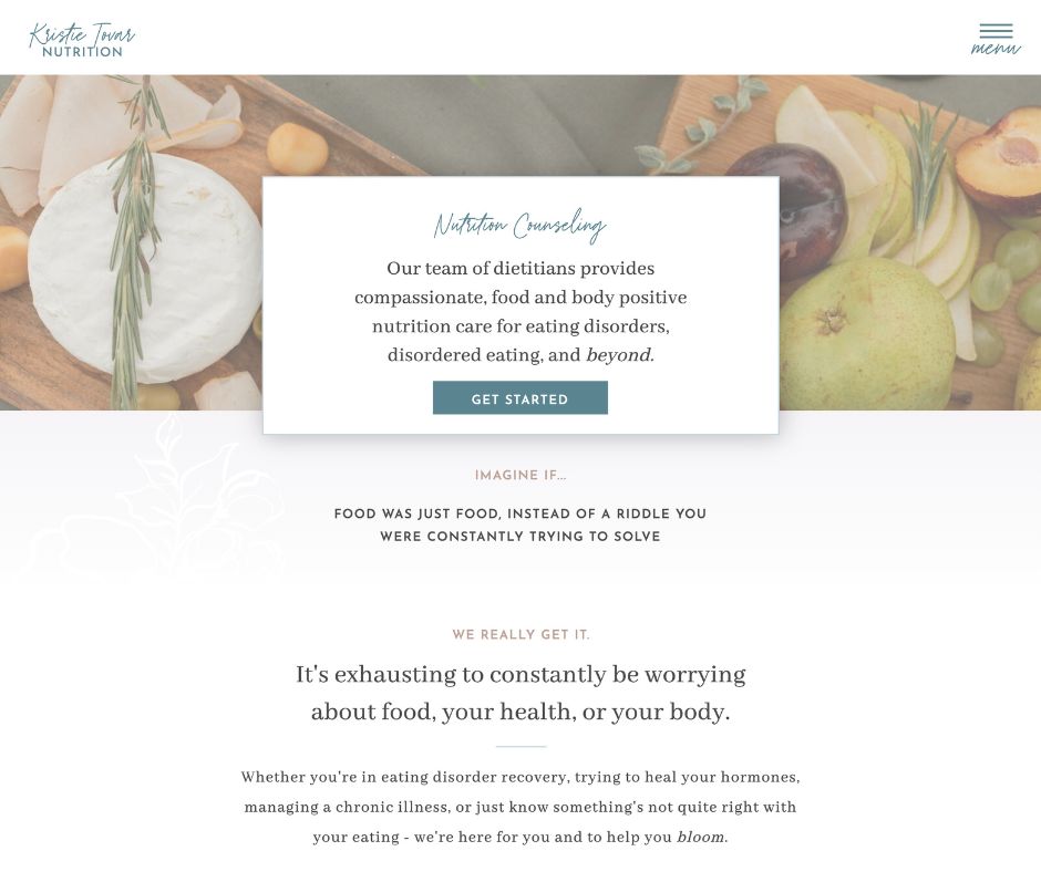
We organized the site into the three main “buckets” of clients that Kristie Tovar Nutrition serves: eating disorder recovery, family services (family sessions for those in ED recovery) and women's/hormone health. This not only let us serve up three really clear website visitor journeys, but by giving each specialty its own page, we created more opportunity for SEO growth in the future as well.
You can see a before & after of Kristie's site above, and view the full project here!
What Kristie's Saying…
I am so excited for our new branding and website! I am feeling more confident and I'm looking forward to marketing my new group practice and putting us out there! I feel relieved that it is done and I don't have to worry about it any more. It was taking up a lot of headspace.
My Favorite Feature
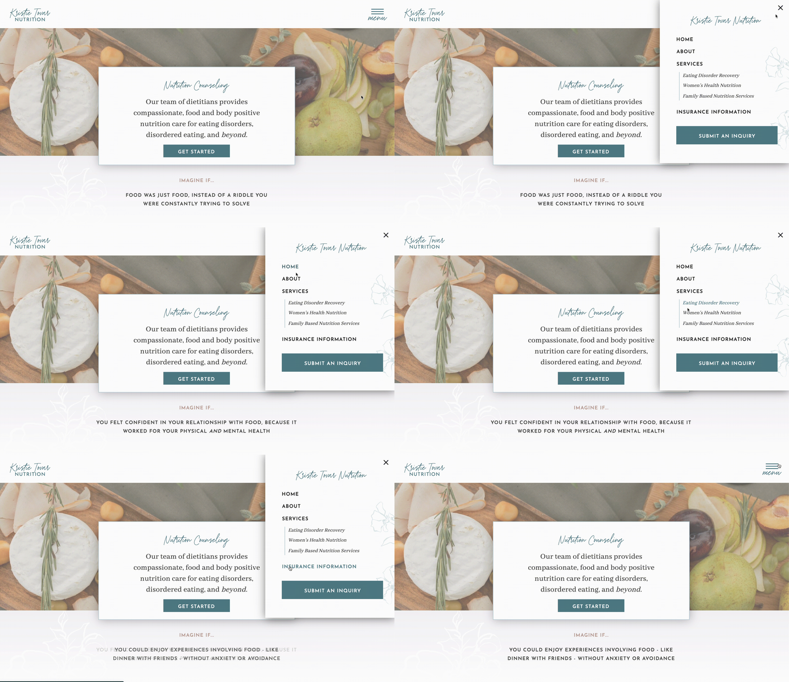
…is this pop-out menu we opted for instead of a more traditional across-the-top option! This helped us organize the website in a way that makes it very clear what specialties KTN provides, and where people should go for more information.
Congratulations to Kristie Tovar & team on the launch of your new website!
share this post
« Booked Out Designer by Elizabeth McCravy | My Honest Review
A Modern, Elevated Dietitian Brand & Website | Body of Knowledge Nutrition »